Humans evolved with two forward-facing eyes. What does this evolutionary detail have to do with retail merchandising? Just about everything.
When consumers are considering products on store shelves, they typically face forward and focus on one spot directly in front of them. Limited peripheral vision may be used if another item stands out, in which items that are closer to the initial staring point would be easier to spot. For that reason, the best way to grab consumers’ attention—and hopefully their purchase—is to make sure that their eyes are focused on your product.
Packaging, shelf placement, and merchandising all help draw consumers’ initial attention to a product. But maintaining that attention long enough for consumers to decide to buy the product is a bit more difficult. Shoppers naturally scan shelves when searching for items to purchase. In ideal circumstances, shoppers will see one of your products on a shelf and then continue to look at all the product offerings from your brand, eventually selecting one or more to buy.
Circumstances are not always this ideal, however, and maintaining consumers’ attention on your brand can be challenging. There are two major considerations for brands in this scenario: assortment size and brand blocking.
Assortment Sizes: Optimal, Not Larger
Determining the appropriate assortment size is difficult for brands. On the one hand, a large assortment of cookie flavors (with new ones appearing every few months) attracts a viewer’s interest and curiosity. On the other hand, large assortment size may overwhelm and interfere with a simple purchasing choice. Simple utility products, like ballpoint pens, fall under this category.
This paradox of choice can be confusing for brands. Should brands offer larger or smaller product assortments? The answer for many comes down to the type of product and the use of the product. If the product is a pen, mint gum, or some other utilitarian item, then people want to see a limited number of options. It makes their choice easier and quicker.
Yet, with pleasurable items like cookies or Goldfish® crackers, people enjoy having a variety of options and choosing between them. So, if consumers have a preexisting preference for variety in product options, then larger assortments will increase product purchasing.
Brand-Blocking Planogram

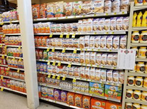
This is an example of horizontal brand blocking. Source: ManaFoods
There are typically two ways that a store shelf will be organized: by brand or by item. For example, the jam section at a grocery store might be organized with all Smucker’s® products in one area and other brands grouped in other areas. Alternately, a store could put strawberry jams in one section and raspberry jams next to them. As it turns out, shelf organization can encourage different types of consumer behavior.
Brand-sorted display encourages more brand loyalty, whereas an attribute-based display encourages brand switching and variety seeking. The type of display used will depend on a brand’s goals.
With brand-blocking, which is the display of a brand all together on the shelf, the direction of the block must be considered. A recent study proved that by grouping products together vertically on the shelf, existing customers are more likely to purchase the product. The idea is that the customer will scan the shelf like a book, from one side to the other, and a vertical “block” will block their path once the desired product is found.
However, if a brand is new to the shelf and wants a consumer to notice them or if a retailer wants consumers to spend more time browsing, horizontal blocking is a better strategy. It forces shoppers to “read” the shelf down horizontal block. It is important to note that this is closely tied to assortment, and therefore only a positive strategy if a larger assortment is present and preferred.
Observa’s Ring of Buyer Shelf Placement
Brands need to know how their products are arranged on store shelves. Are products grouped together on a shelf, and is the display pleasing to the consumer eye? Or are products spread out vertically, blocking the eyes’ natural movement? Are products next to the category captain or on the outer side of the category? Clustering products and keeping them in consumers’ line of sight when they are looking at shelves will increase shopper attention and sales.
Observa analyzes shelves with a few key metrics, including “Ring of Buyer.” Ring of Buyer examines product arrangement on a shelf in comparison to the category leader. If the product sits on the other side of the category, it might be getting less attention from potential shoppers.


